
In the post I did on my office, I mentioned my Style Files & a few of you were interested in how I organize them. My Style Files are a set of binders (that's them above, in the winebox) that I house all of the pages I've ripped out of magazines & printed out from blogs. They're my inspiration files & I can always go back & read an article or look at photos for ideas.
 I have 14 different categories & I separate all the pictures into separate style files. Each file is in a binder & I put the torn out pages into clear page protectors. I also save all of the 'resources' sections from the back of the magazines and put them in a separate folder in case I need anything for future reference. I always make sure to write the month & magazine name at the bottom of each photo (if it's not there already) so I can easily find anything in the resource folder if I need it later. (I didn't used to do this in the beginning & regret it!!)
 I chose 14 categories because it worked for me (I could probably have done more) & because I had storage boxes that I wanted the binders to fit into perfectly. (ha! I know, I can be OCD at times!) But I really like having the files transportable so I can take them around the house with me: into the living room to watch a movie or (eeesh, should I be admitting this?!!) into the bedroom

 I tear out all the pictures from magazines & put them in page protectors when we're watching a movie. That pile then gets put into all the different binders. But I keep one of these big baskets (below) as my filing basket & all the pages waiting to go in stay there because I'm never done. As my tastes evolve, I also recategorize the rooms and I get rid of pictures I'm not interested in any more.
  Just to warn you, some of these categories & the pics I've put into them may seem out of left field, so don't think I'm crazy!! I realize there's a lot of overlap & the point of the Style Files is for you to be able to to have a reference that works for you. So this-however illogical it may seem! - works for me. :)


 3. "Vibrant- Bohemiam- Eclectic" These rooms have bright colors & feel as if they were created over time with collected items. A world-traveller might live here. Or a hippie. The items in the rooms are interesting & the rooms have that laid-back collected look.


 5. "Today's Cottage" These homes are usually a play of old & new. Theyhave those older, charming, cottage elements to them but they are also infused with modern furnishings & elements. You feel as if you're in an older home that has been brought perfectly into today.


 10. "Rustic Elements" This one is fairly self-exaplanatory & has rustic elements such as raw beam celings, stone fireplaces, rough hewn furniture, and antlers. Some of these rooms are surprisingly quite refined.


 11. "Villa Style" These homes are huge & typical of an Italian or Spanish villa or Mediterranean- style homes. They have cathedral ceilinegs, and can have some rustic elements &/ or Moorish & Tuscan elements. I don't do much of this and so again, lots of different styles have been squeezed into one file but it makes sense for me.


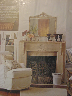


I have 14 different categories & I separate all the pictures into separate style files. Each file is in a binder & I put the torn out pages into clear page protectors. I also save all of the 'resources' sections from the back of the magazines and put them in a separate folder in case I need anything for future reference. I always make sure to write the month & magazine name at the bottom of each photo (if it's not there already) so I can easily find anything in the resource folder if I need it later. (I didn't used to do this in the beginning & regret it!!) I chose 14 categories because it worked for me (I could probably have done more) & because I had storage boxes that I wanted the binders to fit into perfectly. (ha! I know, I can be OCD at times!) But I really like having the files transportable so I can take them around the house with me: into the living room to watch a movie or (eeesh, should I be admitting this?!!) into the bedroom The more categories you have, the longer it takes you to figure out which file to put which pages into, but it's also more rewarding in the end, because the articles are easier to find later and it forces you to really analyze the articles & photos & to exercise your design brain. You really start to evaluate the details & I think once you're forcing yourself to categorize information like that, you're honing your eye & becoming more critical & growing as a designer/ decorator/ homeowner. You'll develop favorites & learn why you love those spaces and it'll help you create your own spaces (below):
The catgeories I came up with work for me & may help you figure out your own categories, but it's a very subjective thing & how you categorize rooms (because so many are such a combination of styles) is really up to you. I go with what feels the strongest to me when I look at the room. Sometimes a room will be in a rustic farmhouse & have more modern furnishings... if I'm more interested in the farmhouse details & architecture of the room, then I might file it under "Farmhouse/ Country Elements," but if I thought I would use it more as a reference for the furnishings, it might go under "Modern Elements." Some of my categories are based more upon furniture styles and others are based more upon feelings. It's not exact by any means. And lots of times I change my mind later; it's a process.
I tear out all the pictures from magazines & put them in page protectors when we're watching a movie. That pile then gets put into all the different binders. But I keep one of these big baskets (below) as my filing basket & all the pages waiting to go in stay there because I'm never done. As my tastes evolve, I also recategorize the rooms and I get rid of pictures I'm not interested in any more. Just to warn you, some of these categories & the pics I've put into them may seem out of left field, so don't think I'm crazy!! I realize there's a lot of overlap & the point of the Style Files is for you to be able to to have a reference that works for you. So this-however illogical it may seem! - works for me. :)Ok, so here are my categories: (and I apologize for the image quality- I used photos of my actual Style Files!!)
1. "Feminine Cottage" The rooms feel feminine & pretty to me. They're not usually in massive, grand homes & they typically have pale colors, maybe skirts on the furnishings, maybe lots of florals, but there is a definite soft, femine quality to these spaces.
2. "Farmhouse/ Country" These rooms have farmhouse and/ or Country elements to them. Maybe simple early-American furnishings or country kitchens or gingham, but whatever it is, it has this feeling for me when I look at the room.
3. "Vibrant- Bohemiam- Eclectic" These rooms have bright colors & feel as if they were created over time with collected items. A world-traveller might live here. Or a hippie. The items in the rooms are interesting & the rooms have that laid-back collected look. 4. "Coastal" These homes feel like they could be on the water & usually are. Lots of whites & blues & nautical items like lanterns & coral, although the color schemes don't always have to be blues & whites. They feel airy & open.
5. "Today's Cottage" These homes are usually a play of old & new. Theyhave those older, charming, cottage elements to them but they are also infused with modern furnishings & elements. You feel as if you're in an older home that has been brought perfectly into today. 6. "Transitional- Calming" These spaces are transitional in style & have a calm, cool feeling about them. They can be similar to "Today's Cottage" rooms but are usually larger & a tiny bit more refined. They tend to be cool neutrals and have some neoclassical elements, usually mahogany, & feel restful & open.
7. "Transitional- warm" These spaces are also transitional & fairly neutral, but they have a warm, cozier feeling about them. There are often piles of books and warm walnut woods in them. These rooms are open & feel very stylish.
8. "Modern Elements" {I'm not huge into modern, so this is my one file and it unfortunately smashes a range of different styles into one} These spaces just feel modern to me- many of the ones I've collected have some warm or natural elements.
9. "Glam Elements" These rooms usually have lots of sparkle & feel swanky. They often have art deco elements & maybe bold feminine colors such as fuscia or purple. They range over a bunch of different furniture style s& can be modern or traditional, but the overall feeling is "glamorous" and there's often a lot of fun energy in these rooms.
10. "Rustic Elements" This one is fairly self-exaplanatory & has rustic elements such as raw beam celings, stone fireplaces, rough hewn furniture, and antlers. Some of these rooms are surprisingly quite refined. 11. "Villa Style" These homes are huge & typical of an Italian or Spanish villa or Mediterranean- style homes. They have cathedral ceilinegs, and can have some rustic elements &/ or Moorish & Tuscan elements. I don't do much of this and so again, lots of different styles have been squeezed into one file but it makes sense for me. 12. "Provincial" These spaces are more rustic versions of formal European styles, such as "the Louis's." They may include furnishings from Sweden, France & other European countries, but they are less grand versions of their formal counterparts.
13. "Formal European" These rooms feel grand & have formal elements that make me think of the styles of the courts. They often include silk, taffeta, formal draperies and/ or lots of ornamentation depending upon the room.
14. "English Elements" These spaces may have traditional English furnishings mixed in with modern pieces & so these rooms can be modern or traditional, but have enough English elements that they make me think "English."
And there you have it!! :) I guess the most important thing here is that the files give you a way to categorize all of the images & stories we're constantly finding so you can use them. I make inspiration boards for clients from all of these images (photocopies of them) & it's so easy & fun when they're categorized.

So what are your favorite categories? Any speak to you?
xoxo,
lauren


 The counters were the original ones from the 50s (I actually liked them with the stainless steel frame) and the backsplash was the yellow 50s tile with the green tile running through it. eeesh! The kitchen was dark & closed-in-feeling and did not make you want to linger. It felt like the walls were closing in all around you. (I can say these terrible things about the kitchen because I know my mother-in-law, Sharon, has even stronger feelings about the kitchen than I did & will not be insulted.)


 Below is a picture of the kitchen after the paint job but before the mini makeover. The apple clock hides an unsightly outlet but was not okay with me ;) (below)


