Wednesday, November 25, 2009

Be Thankful For: The Democratization of Decorating

Years ago it was much harder for the average person to have a stylish home. Curtains were handmade because off-the-rack-sources didn't exist. Furniture was painstakingly purchased and lots of people went without. Those who did have curtains & custom upholstery made, went a little nutty with the matching because they could. I remember happily helping my mom as a kid decorate our living room in perfectly coordinated fabrics below:

As much as we might roll our eyes at Pottery Barn or Ballard Designs, they really have helped to democratize decorating for the masses. They brought affordable (more affordable) style into people's homes. I remember browsing Ballard Catalogs as a teenager and wishing I could have a grand formal home with topiaries & (reproduction but I didn't know it) paintings of Greek columns and just wanting everything in there. (Thankfully, both Ballard Designs & I have changed our styles a bit since then!- see pic below :)
But for those homes that didn't subscribe to design magazines (like mine) the catalogs were IT. I poured over those catalogs the way I pour over design magazines today. I tore out pages (and still have some- I need to find them & scan them in for a post) for my inspiration files on my teenage bedroom decor: Pottery Barn, Ikea & Ballard. Whether the design was "good" or "bad" is irrelevant: the important thing is that they reached lots of homes & got people thinking about their spaces & how they could affordably improve them.


And in the 10 years since I was tearing out their pages for files, the general population has become so much more design-savvy & the catalogs have managed to keep up & help us get here. (And so many more have arrived on the main scene: Wisteria, Crate & Barrel, Williams Sonoma Home, RH to name a few... And of course Target & Bed Bath & Beyond & Linens N Things too.) (glass ball lamp from Target below)

I won't even get into cost or quality and I don't even necessarily shop at all of these stores, but what amazes me is how far they've brought us design-wise. Good design used to be something generally reserved for those with money. Of course when people made purchases they tried to shop wisely & make their spaces as beautiful/ functional as they could (and many of them did), but the variety of sources was just so much more limited than it is today & it was just that much harder to do so. Today, you can go to Ikea & a bunch of thrift stores & create a beautiful space without spending an arm and a leg. Take my bedroom (pic below) for example: You couldn't do this before. We're now at a point where even in the very early stages of decorating ( & for lots of young people who are just starting out) we can have a beautiful look. With craigslist (sending old purchases out & even bringing new ones in) we can upgrade our spaces as we go along.
With the onslaught of home-decorating shows on channels like HGTV, the average person is just so much more exposed to design than he/ she used to be. (To be honest, I don't have cable & really only like a VERY VERY small number of the design shows out there because I think the design is so gaaaaaah on so many of them) BUT still- most of the time, spaces are improved & by watching the shows people begin to develop an eye for design. We can figure out & assess what we like and don't like. Learn budget-friendly tips & tricks. Just getting more EXPOSURE to design in general has made the average person so much more design-savvy.

And let's not forget magazines like Domino or Cottage Living who featured beautiful affordable spaces. Neither of them were able to get to a very ripe age, but I still have hope that there's a good one out there waiting to be born. (Or maybe exists & I don't know about it?!!! ) But magazines like these got us thinking. They got us realizing that we could do what the people in those gorgeous pictures were doing: creating a beautiful home on a budget. (HINT! HINT if anybody in the mag industry is out there!! We're STARVING for a magazine like these!!!! ) (Now I know many of the rooms featured were WAY out of my budget, but the ideas themselves could easily be used for someone on my budget which is what I loved. For example, you could subsitute Home Depot's custom jute roman shades ($25) for a custom set ($250) and still have "the look.")


And don't even get me started on blogs. New ones are popping up daily (I wish I could stop time just to read all of my favorite blogs- there are so many now!) and there are so many creative people out there showing how to live beautifully & affordably & making good design super-accessible. They inspire us to think outside the box & make our homes our own. (Thanksgiving Table below by Eddie Ross)

I will admit: I LOVE custom pieces & fabrics & do believe they can often make or break a room. My LR curtains, chairs & sofa were all done in fabrics I chose. BUT when it came to my accessories & casegoods, I went with thrift store & ebay finds, antiques, & less expensive catalog items. (Now these aren't guidelines for everyone- you might fall in love with the perfect dining room table from a designer showroom & maybe that's your LOVE.) But my point is that through dissecting room after room in catalogs, design magazines, and blogs, I was able to figure out how budget decorating would work for me in my space: Where it was I wanted to save and where it was I needed a splurge in order to get my look.
In catalogs, I saw what I liked (functional, pretty, clean spaces with some nice pieces) & disliked (sometimes a lack of character, layers, individuality) & took what I thought was the best from them & did the same thing with magazines. (Now think about it really quickly, because I'm not knocking the catalogue companies- when you are staging a home for sale- you make the space look pretty & nice, but you DEPERSONALIZE it in order to sell it. You remove personal items like photos & crazy artwork & wall effects that might not appeal to everyone... Well, catalogues are doing the same thing. Their job is ulitimately to sell and if they personalize spaces too much, they won't appeal to the masses, which is what they need to do to sell the most amount of goods. So it makes sense that we might often feel that a showroom or catalog room isn't a "real'' space or something to aspire to.) Anyway, with magazines, I dissected what I loved about them & eventually developed my own (ever-evolving!) style. I figured out how to get looks I loved for less. (image below from cococozy)

I started out as design-clueless as anyone. (I always loved decorating & rearranging my room as a little girl but Laura Ashley was pretty much the extent of my decorating- below, but mine was much worse.) Good style develops over time, and thanks to aqll of the readily available tools: catalogs & blogs & shows & design magazines, it's more attainable than ever these days to achieve it in our own spaces.


So, along with everything good in my life- my family, my friends, my faith, my health, my home, my business, my time, YOU- I'm thankful for accessible design this Thanksgiving. (Don't worry- I won't say that at the Thankgiving table- I would totally get looks for that one! ha!) How about you?
Have a Happy Thanksgiving!!!!
xoxo,
lauren
***update*** Janell brought up a really great point in the comments (#2) that this whole thing has also created more pros and challenges on the flip side, often for working with designers. It's awesome for designers to get such style-savvy clients (we love it!!) but it can also be difficult because some of the expectations created by these shows are unrealistic. If you decide not to "do it yourself" & elect to hire a designer (which can save you a lot of money in time & mistakes) there will of course be fees for your designer's services & those services should still hold as much value as they used to.
I have met with clients who want "design on a dime"-type designing but what they might not initially realize when contacting me is that the space will not take me any less time or effort or ingenuity to create (often more!) and so my fees for a designing like this can cost even more than my fees for sourcing a room of a more sizable budget. (This is because sourcing for discount items, fleamarketing, thrifting, etc. takes WAY more time than it would on a standard design. These design shows have crews of people providing free labor-often the biggest expense- and sourcing budget items & designing for FREE... The man-hours that go into creating these spaces costs money in real life. If they were to add up all of these true labor costs, the spaces would cost WAY more than "a dime.") I always try to make sure my designs fit within a client's budget but that budget of course has to allow for my fee... Because as much as I love doing this- we have to eat!! :)
SO- my thoughts are that the exposure & accessibility to all of this design is great for us all, but that in the end what it all comes down to is being able to put it together in a beautiful, functional way- by yourself or with help- whichever way works best for you!

Monday, November 23, 2009

Wallpaper Stencil LOVE


Well my sweet husband finished the LR wallpaper stenciling this weekend!! The stencil was roughly 17 x 20 inches & it took 3 days of painting. (RL stencil from here )


He says the worst part about it was having to wash out the stencil between every few applications of the stencil. We used a latex paint: Sherwin Williams 'Ancestral Gold' recommended by Maria from Colour Me Happy & the color coudn't be more perfect!! (a pale goldy-green- awesome with the sofa- Thank you Maria!!! :) He didn't use a stencil brush & we just went with a Home Depot cheapie about 2-3 inches wide. The application isn't even & is just what I was looking for. (perfect imperfection!!)


Here's what our living room looked like before:


And here it is after the stenciling:


(A clear glass floor lamp is on its way to the right of the fireplace to balance out the chandelier & we're adding a custom mirror in the fireplace box.) It's hard to see in the far away photos because of the light coming in through the windows, but there is a sort of grid-like pattern where the stencil applications meet. I've been going around by hand to fill in these areas (this will also take FOREVER) but it's worth it because it makes it look continuous.


It reminds me a little of my grandparents' wallpaper (where I lived growing up) and looking at it just gives me this feeling of "home." I seriously teared up when Dave finished it. (ha pregnancy! ;) It looks like a timeworn wallpaper & I couldn't be happier. It really warmed up the room & made that huge high wall feel smaller.


Now my dilemma is this: I don't think I can cover it up with my 30 Leonardo Da Vinci sketches!! (At least not right away because I just want to gaze at it lovingly.. not kidding.) But I already ordered them... SO now I think I'm going for a CRAZY gallery entry with them going all the way up the 3 walls in the entryway. Any thoughts??? Should I put them in the living room or entry? If I put them in the entry, what your thoughts on the living room? Should I put the black window-like mirrors back? (in above before pic-- they're very loft-like & strong.) Just keep it empty & lean whichever mirror and/ or art I feel like at any given time? (below) Do you think it feels too empty as it is now? (This is tough because it feels "emptier" in photos than in person because the wallpaper stencil stands out much more in person...)


Ok, would love your thoughts & ideas. And one last pic of my chemistry beakers!! (In case you didn't read the comments in a previous post, I had to laugh so hard when Terri of WindLost said she loved everything in the room except for the chemistry beakers because she's a scientist. hahaha Yes, I have to agree that I wouldn't feel the same way about them had I her job!!)


Looking back over the weekend stenciling project: YES, I almost told my husband to quit after it took an hour and a half to do the first 3 stencils. He was a serious trooper & just kept going & going but I KNOW I wouldn't have done it myself. I don't have the patience. IF you have an insane stash of patience, it's a project worth doing, but I agree with many of the comments in my last post that wallpaper doesn't seem nearly as expensive now. He's moving onto the foyer this weekend & that will be rough on a ladder the whole time but I'll post when we have pics!


xoxo,

lauren


ps- Head over to Velvet & Linen to vote for which readers' rooms you think deserve the GORGEOUS brickmaker's coffee table!!! I took part in the selection of the finalists & I cannot tell you how many beautiful well-designed rooms were sent in!! It was SO tough- bloggers & readers are so talented!!!

xoxo

Velvet & Linen's Brickmaker Table!!

Don't forget to head over to Velvet & Linen to vote for who you think should win the INSANELY BEAUTIFUL Brickmaker's Table!!! There are 10 finalists & they're all so different it's almost impossible to pick just one!!!

I wanted this thing BADLY but don't have enough space for it... one day... This was seriously the best giveway I've ever heard of!!

xoxo,

lauren

Friday, November 20, 2009

Wallpaper Stencils

Right now I'm helping (i.e. watching & providing wonderful & lively conversation for) my husband paint this wallpaper stencil all over our living room wall:

A very sweet reader, Mary, gave me the idea to try stenciling after learning that I lusted after wallpaper for my living room & entry. (It's a RL stencil from here and reminds of a henna tattoo & I just LOVE it!! ) It's INSANELY intricate and will most likely take years to complete... No really, it's baaaaaad. It's taking FOREVER. The ceiling is high and the wall continues into the entryway...
Stenciling is for the extremely patient, crafty or BROKE person. (And I'll give you a hint, I'm not patient or crafty... ;) Can you guess what color I chose for the stenciling? The Color Queen from Colour Me Happy (AKA Maria) recommended it to me & it's prefect!!
Have a great weekend & we (he) will be meticulously painting away-- ahhhhhhhhhhhh
xoxo,
lauren

Thursday, November 19, 2009

Thanksgiving Table

I wanted to share with you a Thanksgiving Table centerpiece & Post I did last year at my mom's house. (11/25/08!) I'd just started blogging and I had so much fun setting a pretend table.. How odd it seemed at the time but now it seems totally normal!! Just ignore the lack of silverware & napkins for my imaginary guests! ;)

_____________________________________________________


'
The items used are all flea-market finds from a trip I recently took to Strasburg, Virginia. I started with a simple oat-colored linen runner and put the large white pillar candle holder in the center. (Only $2!)


Then I layered ouwards symmetrically with the pair of smaller milk glass urns & topped them off with pumpkins ($10 for the pair!)


I tucked in a second, larger milk glass urn with a squash in it to informally balance the small milk glass candleholder on the opposite side. (When dealing with thrift-store flea market finds, since it's often hard to come by pairs, you get to have a lot of fun with mismatched pairs & informal balance.)


At the end of the arrangement, I used 2 busts of a little boy and girl. I debated over buying them & am now so glad I went for them. At only $8 for the pair and now seeing how quirky they look on the table, I don't know why I wasn't crazy over them from the beginning! (I love weird little objects :)


And finally, I added this little tree made out of amber that my mom & stepdad found on a trip to Lithuania. It's like a little gemstone bouquet. It looks good no matter where you put it.


I think my mom's wedding china looks perfect with such a simple arrangement. The room's crewel draperies, stained-glass window & bold-patterned rug made me want to do a really simple table setting.


Here's a close-up of the large urn with the squash in it. I thought it was a pretty picture. :)


Here you can see my mom's cabinet full of crystal. It's got some beautiful pieces given to her by my grandfather & also an amazing vintage cut crystal collection handed down to her from my stepdad's family. She's never had it displayed before & recently purchased the cabinet & was finally able to enjoy it!


Anyway, I'm off to pack for our trip to visit my dad for Thanksgiving! If I'm able to, I'll post some pictures of our table there! (His kitchen is finally in & I cannot wait to see it!!!)
Here's one last picture & have a very happy & beautiful Thanksgiving!!! Keep it simple & have fun!! xoxo


______________________________________________________

Hope you enjoyed the little trip down memory lane! Thanksgiving will be at my mom's house this year & I'm already getting excited for my grandmother's homemade noodles!!! mmmm mmm mm!!!
xoxo,
lauren

Wednesday, November 18, 2009

Pure Style Home: The Open Sky Project

I wanted to let you in on a little something that's in the works right now. I've joined The Open Sky Project & will be opening up an online store featuring some of my favorite products. The Open Sky Project is a new concept & company: It's an online store that sells products through a series of "Shops" owned by "Experts." Many of the experts are bloggers in various areas of interest ranging from cooking to gardening to fishing & we've all chosen some of our favorite things to sell. (I'll be joining in as the second interior decor shop.) Its goal is to make the online shopping experience personal. You're comfortable buying because it's a recommendation from someone you trust. If I were into fishing I'd trust him:


hee hee Anyway, I'm in the midst of choosing my products & would love your input! I've got my eye on a few things but am looking for more ideas! What would you like to see? What do you think buyers would be interested in buying?


It can be anything from lighting to pillows to rugs to accessories to artwork. Right now I'm leaning towards some of my favorite things in my own home- the things people email me about asking where to find. I definitely want to include a nice slew of beautiful & budget-friendly products. Any thoughts? As soon as my shop launches, I'll let you know. Thanks so much for your help & I can't wait!!

xoxo,

lauren

A Southern Living Before & After

I was asked to review this November's issue of Southern Living, and have to say that I loved so many things about it, but my favorite had to be this bedroom before & after. (Photos by Laurey W. Glenn) Here's the before, which is so much like my own (in-need-of-love) guest bedroom:

And here's the After:
I love it!!! It belongs to Mary Ankar & she was assisted by none other than Anne Turner Carroll. (I think it's safe to say we bloggers pretty much love anything she gets her hands on.) What made the biggest impact in the space was the addition of the gray-green grasscloth wallpaper. I think I MUST have this somewhere in my house:
Our guest bedroom has a pair of glass lamps just like this & a very similar bed and I will have to fight with all of my being to not straight-up copy this room!! :) hahah
Also check out the before of the antique chair:

And how perfect is it now?! :
The roman shades are hung just under the crown molding & I love their relaxed elegance...
The antique desk looks far from old with the modern lamp & artwork above it. They put sketches in ready-made frames for budget-friendly accessories:
The pillow (I have to say this!) is just like the body pillow on my bed! (here I thought it was so original!! oh well ;)But I just LOVE IT!!! It's from a rug they purchased for the room that didn't work & they had it turned into a pillow. The pattern is gorgeous & it really oomphs the style level in the room. (And I can tell you how easy haveing one big pillow is!)

And finally, Anne Turner Carroll created this arrangement below out of mounted wallpaper. She felt an entire wall or large canvas of it would have been too much for the space so she broke it up. What a great idea!!! Especially if you have pretty wallpaper remnants- which I do!!! (remember the kitchen nook?!) Love the pops of yellow throught the room...
Anyway, with the loss of some of my favorite magazines (Domino & Cottage Living--- tears!!) I was really happy to see such a fresh, young space in Southern Living. There are a few more in this issue & I'm hoping this is how it will stay. We're all out here begging for some new, budget-friendly, beautiful "real" spaces!!!
xoxo,
lauren
ps- Thank you SO much for all the sweet comments about our bedroom redo!! (previous post) It really make it all worth it!! :)

Monday, November 16, 2009

Our 70s Split Redo Part IV: The Master Bedroom

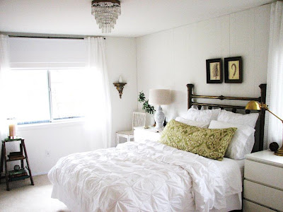
So I finally took pics of our bedroom! (a million!!- sorry!) Here's what it looked like when we first moved in. Scary, I know. The curtains were leftover from our old house & we had to hang them for privacy until I could get longer ones. (They were one of the last things we added to the room so anytime someone walked in I was so embarrassed! :) The limewashed paneling was pretty bad but appealed to me in a weird way... We stuck to our budget and spent just under $1000 in this room. We didn't replace the (new, clean-but-boring) carpet but have plans to do so. (Probably with a natural woven wall-to-wall carpet like seagrass or sisal.)


Here it is now:


I knew I wanted all-white because there's just nothing more relaxing to me & we really wanted to focus on the wooded views outside the windows. And I love getting into a clean white bed with fresh linens. Just love it!! (The duvet cover is from West Elm & I like the fact that it's pretty even when it's not made :) We keep our current books on the old step ladder (above) under the window that we found outside our house in the bushes. It keeps things neat.


What inspired the rest of the room was the antique brass headboard. (below) We found it on the side of the road set out trash when we first moved in. (One of my best trash-picks ever.) It's a double bed but works fine for our queen bed.


For our bedside tables we went with the Malm dressers from Ikea. (I think around $65 each?) We needed the storage space and I love having a big nightstand. I wanted modern & simple & I've always loved the lines of these. I chose an antique brass reading lamp by Robert Abbey suggested to me by Reichel of Copy Cat Chic (thank you!!! :) because it was such a better price than the Restoration Hardware one I was lusting after & had the same look. I love having the dimmer at night.


On the other nightstand we used the Chinoiserie ginger jar lamp I found on our first flea market with Eddie & Jaithan for only $20! I'd been searching for one of these for years as my grandmother had them when I was growing up at their house & I always loved them. (And she's not ready to part with them! ;)


I found the vintage crystal chandelier (below) at On a Whim (in Lucketts, VA ) last December and kept my fingers crossed that it would still be there when I realized how perfect it would be for our bedroom. I was lucky!!! I ripped the two fern prints above the bed out of a book we had & put them into $1 frames I found at a thrift shop. I love them against the paneling...


We have a semi-awkward wall on one side of the bedroom: not enough space for a piece of furniture but still a pretty substantial wall. I decided it would be a fun spot to hang some of my jewelry so I could enjoy it even when I'm not wearing it. (below)


I simply hammered in some large nails & had fun hanging the necklaces by color & size. It's one of those little things that just makes me really happy. I end up wearing it more instead of forgetting about it in my jewelry box. The chair was $13 at a thrift store & I painted it white.

The huge pillow on the bed is a cheap body pillow from Target that I had covered in a rich greeny-goldy ikat that I found at Calico Corners for 60% off.
I really wanted the room to have a simple & modern feeling with a touch of feminine & ornate detailing... This picture below kind of embodies the whole idea: ornate gilded sconces from my grandmother topped with a simple white vase from ikea. (We have one on either side of the window.)
And this seriously scrolly hand-carved bevelled mirror found at Lucketts was our splurge at $250. Its lines remind me a little of fern... I stare at it in bed & find lots of shapes & faces (there's an owl guy hidden in there) and I never tire of it.


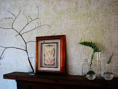
And whenever I take pics of our house, I pretty much move these chemistry beakers into the room. (haha oh well.) Here I used fern from outside (where the Boston fern now lives :) and love them paired with the fern prints. Such a simple easy arrangement...
The white roman shades are off-the-rack from Sears & I swear by them. They're thermal-lined & if you can find the right size, they're awesome. The curtains are from Ikea. One last little look:
Thanks so much for reading & hope you enjoyed the tour! Have a great day!!!
xoxo,
lauren
ps- Just in case you missed the others: