
Anyway, I got some really great comments- some thought it was very wrong of me to continue on with the client, others thought that as a designer it's your job to take into account your client's tastes & styles & to create a well-done room for them based upon knowing what is good design & trying to make it work with their vision. I've decided that if this becomes apparent in a future project I will bring it to the client's attention and either let us come to an understanding or help him/ her find someone else.
But this comment in particular brought me into another line of thought:
From Anon: "I am not a designer, but I agree with Anon 9:23. When I look at designers I admire and who have traction over time, they take their ego out of the picture and make the client the star. I am concerned about designers who only have a set design, a go to personal aesthetic without ever wanting to design for the client's wishes, wants, and the particular issues the client's home creates. In the end, this kind of one-note design mandated by the designer never grows, never changes and becomes a time capsule. "

I have to disagree with Anon. (above) I think he/ she might be mixing up aesthetic with design style. (I'm not talking different styles such as "shabby chic" or "art deco" or "rustic" but design aesthetics.) They are two very different things & I think it's important to distinguish between the two.

According to wikipedia ,"Aesthetics is commonly known as the study of sensory or sensori-emotional values, sometimes called judgments of sentiment and taste.[1] More broadly, scholars in the field define aesthetics as "critical reflection on art, culture and nature."[2][3] Aesthetics is a subdiscipline of axiology, a branch of philosophy, and is closely associated with the philosophy of art.[4] Aesthetics studies new ways of seeing and of perceiving the world

I believe what makes each designer unique & different is his or her aesthetic. It's WHY people hire a particular designer in the first place... Because they appreciate the designer's aesthetic. Designers who develop signature looks can and DO do a wide range of design styles - contemporary, traditional, transitional, etc- but their aesthetics are apparent in each room they do.

I do not think it's an ego thing at all... I think it's being good at what you do. I believe it's a designer's job to make each design deeply personal for a client but to also make it work & make it a good design & to do your job as a designer. When I think of some of the "greats" and of some of my favorite interior designers: Darryl Carter(image below), Bunny Williams, Brooke Gianetti, Steven Gambrel(image above), Nate Berkus, Albert Hadley ... they have very strong design aesthetics that can be seen in each & every space they do but no one would say they only did one style of design. They design beautiful spaces that thrill their clients & withstand the test of time, not "time capsules" as Anon says designers who impart their own personal aesthetics create.

I also don't think there really should be a "star" in design either... the design should be all about the client & very personal, but I also think the designer owes it to the client to put his/ her best design forward, to make sure the design is well-done & of a certain caliber... the caliber for which the designer was hired for in the first place. I really think of it as a collaboration...
So, what are your thoughts? (I told you this was a can of worms!! :) Do you think a designer should not let his/her personal aesthetic come into the picture when designing for a client? Or should he/ she create a personal design for a client guided by his/her own design aesthetic? Do you think designers with "signature looks" are egotistical? Are they creating rooms that won't stand the test of time?
ps- Also thought this Albert Hadley article was really interesting: http://nymag.com/nymetro/shopping/homedesign/features/n_10144/
xoxo,
lauren
*** UPDATE-- so my computer's being weird & won't let me leave a comment so I cut & pasted it. This would be comment #20: (sorry I'm so long-winded!!!)
hahaha oh my gosh I just wrote the longest comment back and it erased!!!!
I don't know if I can do it again!! (but of course I'm going to try!! :)
mave,First, thanks for putting your name because I think a lot of people who disagree with posts, don't, so I appreciate that.
Anyway, I don't think it's splitting hairs because I do think there's a big difference in an aesthetic vs. a style. I think you & I will just have to agree to disagree on our definition because I'm the exact opposite: I believe that design styles are derived from aesthetics, not the other way around.
This really is getting into philosophy (but that's exactly what aesthetic is- "Aesthetics is the study of beauty and taste... The word derives from the Greek aisthetikos, meaning "of sense perception." Aesthetics has traditionally been part of philosophical pursuits like epistemology or ethics)
But, Someone with a strong particular aesthetic can do a variety of design styles and their aesthetic comes accross in all of them. This is why we love some designer's work and dislike others... I agree with you that if we don't like a person's aesthetic, it's unlikely that we'll like most of their work, no matter what "design style" they're doing. I can see two "traditional" rooms, for example, and love one and hate the other because of how it was done by the designer... because of their aesthetic and how they approached the design style... Anyway, hope that makes sense but I'm feeling lazy the second time around! :) people define their aesthetic & hone it but can use it to produce any style they want.
I'm not sure if you read the originial post or not, but I did say that there was no budget for new furniture, and the only purchases we were allowed were: bedding, lamps, mirrors and window treatment. I also never said that she was unhappy with the design, only that she wanted "more." We're spoken since the post and she wants me to purchase some pillows and accessories & artwork, which previously was not part of the budget/ plan & is very excited about it. The modern lamps in the room were chosen by her from a selection of lamps and she wanted the room to have a modern vibe, not "old world." Modern but oppulent & gaudy... I actually myself love what I think you're calling "old world" and have done it several times to clients' satisfaction.
The things my client are naturally drawn to, are not in good taste (according to me, because taste is relative) but it's also my job as a designer to steer a client towards what I think of as items in good taste that are within the same style. Hence, the super-satiny bedspread of higher quality than the ones in the inspiration rooms. A blend of shiny & matte throught the room vs. all shiny which is what she originally wanted and would have created a bad design, in my opinion.
There are things we learn as designers and it is our job to create designs based upon our knowledge/ experience. I wouldn't be doing my job if I told a client- "yes, everything you want is perfect for this room," because that's not giving them your expertise or creativity, which is what they're paying you for. Most clients who hire you "tell" you what they like and then it is up to you to create that space for them based upon a lot of questioning, digging, sample-showing, etc. They don't want you to do what they could do themselves.
It's not an ego thing or a matter of pushing yourself on them, but it's where you're coming from. And again, it boils down to, if your design aesthetics are at odds very deep down from the beginning, then I don't think it's a good client-designer match. (Which is really what I've learned through the first post & everyone's comments.)
Also, to the original Anon who I quoted in the above post. I hope you're not upset that I quoted you but I wanted to use your comment to start a new thread/ conversation all-together becasue you did bring up another issue, which I thoguht would spur some great debates.
(I have to admit that on a personal level, I was shocked/ a little hurt by the comment implying that I would put my own ego above the client's or that I only had 1 type of design up my sleeve, but you're entitled to your opinion, just as I am mine, and I do disagree with you.) But I don't take it personally and realize that this is a place to give your opinion & do appreciate your giving yours, which is why I continued the conversation.
Hope you'll be back & thanks so all who joined in!! (And of course keep talking!! :)
xoxo,lauren
ps- there'a probably a word limit on comments and i SO went over it!!! eeeeeek hahaha


 I really can't tell you how much it meant to see so many of you who show up & it was SO GREAT to actually get to meet you in person!!! I really felt like it was an audience full of friends... (I wish you all could have been there, so I'll try & recreate it ;)
 Ok, some of you asked me to videotape it, but I was nervous enough and also am technologically-challenged & unsure of how to get a video online (maybe future??) so I'm going to give you a serious breakdown of what I said & how it went. (I apologize to anyone there because this really is justy a play-by-play and might bore you to hear it a second time!!) I went around the store and arranged accessories on an antique vanity used as a console table, a bookshelf and finally a mantle. I started out telling a story about how my friends & family used to come to my house & every time it looked different. It was rearranged & the living room that used to be blues & greens was now beiges & golds. They'd always come in, say 'hi' to me and then start looking around to see what was new. They'd say things like, "You have WAY too much time on your hands," and "How can you afford to redecorate all the time?"


 And finally, I showed how to arrange a mantle. I started out with an empty one (above)-- do you recognize it? It's ours from our house! (Dave was installing the hardwood floors & it was off the wall so we brought it in for the demonstration) I first showed how just adding a focal point (the mirror- oh the silverleaf driftwood mirror! WOW) and 2 objects for balance (the sconces) and a beautiful centerpiece, you could be finished and have a beautiful, simple arrangement (try to ignore the cords).. it would be created using "formal" balance because everything used has an identical pair except for the central items.


 Thank you SO much to Frances & everyone who attended. I had the best time and you all made me feel so comfortable!!!!
 I found this crazy vintage chipped Chinoiserie Mirror at Lucketts yesterday & just went for it. My entryway is dull and uninviting to use the nicest of terms. It's really bad. (below) yummy linoleum (before.)


 According to

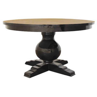
 I've always wanted a round pedestal dining table. (I've also wanted wanted a huge trestle table with a bench for a while but you work with the space you have.) My dining room is awkwardly shaped. It looks large & square when viewing it from the living room, but it's actually rectangular and very narrow when you center a table under the chandelier.

 And here's a close-up of the same room. I'mlLoving the lantern over the table below and the pedestal table is a bit more ornate...
 Here's a strong pedestal, the "Avignon Table" from Horchow. I love these too for larger spaces...
 The pedestal table below has a more transitional style and even though nothing's really going on with the walls, it's okay because the table's just such a perfect focal point.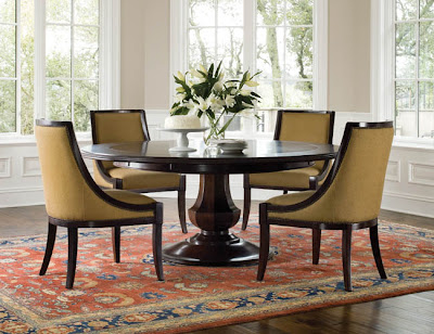

 One of my favorite sources is Martha Stewart Furniture for Bernhardt. I am crazy over their pedestal tables but unfortunatly they were all too big fo rmy dining room. Below is the Grand Lake Pedestal Table and I just LOVE it!!!
 And here is is again (below)... it's just begging to be covered in books!!!
 And here's the Dunmere Pedestal table by martha Stewart. I'm crazy over its lines too!!!

 Below, House Beautiful with pedestal table from Mecox Gardens... Love the drum shade over it!
 A
A Below is a room featured in House Beautiful and (shockingly for House Beautiful!) they used a table from Pottery Barn! I'm loving it.
 And here's the one that arrived at my house yesterday from Pottery Barn. It is the perfect size and comes with a leaf for bigger dinners!! Like I said it was more than I wanted to spend (that just shows you where the budget's at--- when PB is too high-end!!! :) but it really is exactly what we were looking for...