Wednesday, April 21, 2010

More Than One Way To Skin A Cat

When approaching the design of a space, I do believe that there are "wrong" ways to do things, but I also believe that there are multiple"right" ways to do the space.  In my mind, there really is no "right" way, but there is however, a "best" way.  ---a way that feels "right" for the person who lives there & is appropriate for the home.


{Design by Pheobe Howard, Photo by Luke White}

Often times clients show me a room and ask me what I would do- what colors I would use, what materials, etc.  For me, this isn't how it works.  I might know how I would want the space to evolve if it were for me, but until I've really grasped my client's style and their dreams for the space, I really can't answer that question.  I always need to know who my audience is.


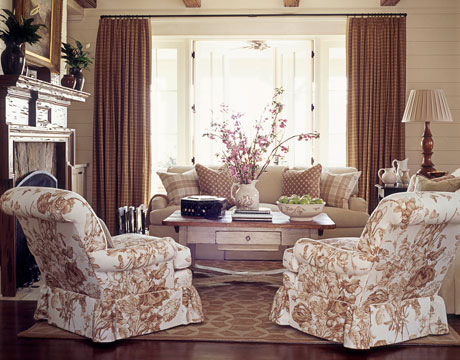
{Design by David deMattei & Patrick Wade, Photo by Jose Picayo}


Once my clients & I have agreed to work together, it's all about me drawing out my clients' wants, needs, tastes, style, etc. to create a vision that I think will be "best" or "right" for them and will work in their home.    It isn't however, the only "right" way to do the space.  If 10 different designers came into that home, there would be 10 different "visions" for the space, all based upon the client's wants/needs and the designer's own aesthetic.  They might all be amazing to viewers like us, but I'm sure the client will have a favorite or "best."  It doesn't mean the others were wrong, however, just not "right" for the client.  The one that might look "best" to outside viewers might not be the homeowner's choice...

Design is personal.  It's one of the reasons when doing a room reveal, that I often explain what I or my client was going for in the space...  An overall mood, feeling, style...  Because there are many "right" ways to do a space, but I want you to know why I made the choices I did.  Coming from the point of view of the homeowner/ designer, a design is often much better understood.  And understanding is one of the first steps in liking.


{Design by Betsy Brown, Photo by Don Freeman}

Before we were married, I knew my husband was the one for me because I felt more understood by him than anyone else in the world.  I didn't have to explain the "whys" of everything, because he just knew why because he understood me & where I was coming from and liked me because of it. 

{us}

It's similar with a space...  If viewers or "judges" (like us blog readers! ;)  know where a client is coming from and what he/ she wants out of the space and how he/ she wants it to feel, we understand it better and appreciate it.  I'm not saying that we cannot judge a space if we don't know where the owner/designer is coming from, but that having that information helps us understand a space a bit more, and in turn, helps us appreciate it.  We may not like even one teensy element of it for our own homes, but we're able to see the beauty in it for someone else. 


{Cathy Kincaid, Photo by Reed Davis}

I don't do "one" style of decorating/ design.  I can't.  My clients all have their own unique styles and I go where their styles take me.  Yes, my own style/ aesthetic plays a major role in how a space will turn out, (which is why there's often a "look" to rooms a designer's done) but it's not limited to styles of furniture or decor...  it's present in the way the space is put together. 

{Darryl Carter, Photo by Simon Upton for Elle Decor}

When you love & appreciate a variety of different styles, you can recognize that there's no one style that's "right"  although you probably have a personal favorite or favorites that you want in your own home.  But when critiquing and evaluating others' interiors, to think that only one style is beautiful/ good is really limiting and elementary.  Trust me, I've been there!!

When I first really became interested in decorating & started experimenting with my first apartments, I began creating rooms that adhered to a "style."  My dining room felt a bit "cottage" and when you were in there you got this feeling.  My living room was kind of an "Eastern" mix full of things from my grandparents' extensive travels. There was another feeling in there.  (And it was right next to the dining room so it wasn't pretty! ;)  My bedroom had a mahogany 4 poster bed and felt a bit British Caribbean...  I could go on, but I think you get the point.  I began with pieces of furniture or accessories that I'd been given or bought & created rooms around them, collecting other items that "went with" others.  It was more "themey" however, because it wasn't authentic and wasn't personal to me. I was creating rooms around furniture/ things, not around and end goal/ mood/ atmosphere.   It should be the other way around:  "Things" are our tools for creating atmosphere. The rooms were great at that time for me in the sense that I was experimenting & using my place as a canvas & learning to put rooms together, but they were totally out of context all squeezed together room-by-room in an apartment.

So what I'm saying is, I could do a home for a client who lives in a cottage and who wants that "cottage" feeling throughout her whole house and we could use lots of cottage-type pieces and it would be appropriate. 

(Ginger Barber, Photo by Victoria Pearson}

What's inappropriate or inauthentic is when it's forced or out of context.  It's like the girl who shows up to the backyard barbeque in 4 inch heels and a short skirt:  she looks great but totally ridiculous for a bbq.  Had my apartment dining room actually been in a cottage, it would have been much better!  (And our girl would look so much better on a hot date than with her heels sinking in the grass at the bbq!)


There are people out there who say they hate neutral interiors or colorful rooms or "cottage style" for example.  Does that make it wrong or bad?  I don't think so.  (hahah only in the case of my dining room!!)  There's good and bad of everything and I think the important thing to ask yourself when judging a room is:  Do I maybe dislike this room because it's not done in a style I like or is it because it's not done well?  I believe we can learn to appreciate many different "styles," just as we can appreciate the value of a well-executed space. 


{Christina Rottman, Photo by Mikkel Vang}

Painting the Rat:  It's similar to art.  Show a photo of a rat to Monet, Van Gogh, and Da Vinci and have them paint it.  Each of the 3 paintings would be totally different yet all of the same rat.  Think of the rat as the "style" and the Painter as the "designer" with his/ her own aproach/ aesthetic.  If you have a problem with the photo of the rat in the first place (the style), then you might not like any of the paintings (the interiors) or even give them a chance because of their subject.  If you close yourself off to a room because of its design style, you won't be able to appreciate it or understand it and you lose the opportunities to grow/ learn/ hone your eye. 


Which Rat Do You Like Best?:  Once you have opened yourself up to the photo of the rat, acknowledging that maybe you don't like the subject matter of a "rat" but you can appreciate the value of a well-done rat, you can begin to evaluate & appreciate the artists' interpretations.  You don't even get to that stage if you shut out the paintings because their subject(style) is a rat (a design style you don't personally like.) Here's where the artist/ or designer's personal aesthetic/ style / approach to design comes into play.  Just as each artist's rat painting would have been executed differently & in his own style, each designer's interiors are executed differently & his/ her own style.  If a designer is good, he/ she can give you a rat if you want one, just as the painter can give you the rat.  If a designer isn't good, then the overall vision he/she  is was trying to achieve for the client would be hazy or lost and it would be a badly done room, as if a terrible painter (like me!) were to attempt the rat. 


You might personally love Monet's rat, but not like Da Vinci's rat.   It's great for you to have an opinion, a favorite that you're passionate about, and by dissecting the reasons why you like one and not the other, you grow.  You could never have done this if you closed your eyes to the paintings in the first place because they were of ugly old rats.

Does this make sense?  It's okay to critique/ judge, but I do believe we need to be open to design styles other than our own if we expect to grow/ learn/ appreciate design. 


{Dana Lyon, Photo by Reed Davis}

This doesn't mean loving everything.  There are plenty of rooms I don't like and even after hearing from where someone was coming from, seeing that the homeowner adores it and that it is appropriate, I still don't like.  That's fine!  We don't have to like everything (and definitely won't) but it's good to dig deeply and ask ourselves "why?"  ...  To just mentally pinch ourselves to doublecheck that it's not because it's done in a style that's different from ours or because we might not understand it. 


{Miles Redd, Photo by Thomas Loof}

Rooms shouldn't need a translation but there are so many spaces that grow on me the more I study them.  (And on the other hand there are rooms I initially think "So pretty!!" and then upon further inspection/ study, they kind of start to bore me...  some of these even being my old houses!)

So maybe a room isn't done exactly the way you would do it, but can you appreciate it anyway?  Is there in fact more than one way to skin a cat?

xoxo,
lauren

*All interiors from House Beautiful unless noted otherwise

Monday, April 19, 2010

Awesome Find: Barley Twist Table


I am so excited about this 19th Century Barley Twist table I found for some of my clients!!  As I've mentioned, I'm really trying to focus on creating spaces for clients that feel as if they've been created over time and that are truly personal.  When I saw this table, (at an insanely good price!!!)  I immediately thought of a young couple I'm working with & sent them photos.  They loved it & I snapped it up!!  It's inset with what looks to be a hand hooked Coat of Arms on the bottom and a Family Crest with two lions on the top preserved under glass.  The fabric is so old it's actually deteriorating but it's just so beautiful & detailed and has so much character.  I love it so much I want to keep it...  and that's when you know it was a good find ;) ;) 

xoxo,
lauren

Sunday, April 18, 2010

Project #12: Grow Your Garden

{Finally putting the garden gloves to some use-  love Springtime!!}

A little over a week ago on one of these gorgeous 80-something degree days we've been having, Christian (my 2-year old) and I planted a bunch of seeds for our gardens.  (While our almost-4-month old took a beautiful-wonderful-heavenly-loooong nap.)

{image found here}

I'm a pretty lazy gardener.  I garden because I love how gardens look, smell, taste, etc, because I want to bring flowers inside & cook with the herbs & vegatables, and most of all, because I just love to be in & around them...  But let me repeat:  I am a lazy gardener.  I'm not really at that therapeautic stage of gardening that so many people I know are at.  At this point in my life, I just want a beautiful usable garden as quickly and easily as possible.  I enjoy  gardening, but it's for the end result that I'm gardening.  (Hopefully one day I'll get back to that whole therapeutic thing...  in high school I looooved it)

{My Helper}

But, I am getting a little better, and this year instead of buying plants from the store like I usually do, inspired by my mom & my friend Amy, I actually planted the seeds myself (and of course with assistance from my helper)  (Okay, Okay, I know it's "sow the seeds" but that's just not they way we say it.)   Of course, it was all done the lazy way.  We used soil from one of our gardens (because we forgot to get potting soil) and I think we might be a bit late in the season, but better late than never.  I'm pretty sure we put way too many seeds in each pot because we ran out of pots.  We haven't exactly watered them consistently, but in under a week, seedlings sprouted!!!  It's so much better than watering dirt!  For actual directions on doing this the right way, check out this article.  But I am waaaaay to lazy (or busy) for that right now...  although maybe we'll separate them out when they get bigger if I can get my hands on some more containers. 


{The sprouts in our sunny laundry room}

Christian is so excited!!  We did basil, zinnias, tomatoes, chives, dill, cilantro & parsley.  We'll put them outside after danger of frost and when we actually get to it.  (I'm hearing Mother's Day is safe)

Outside, we put carrots and lettuce ("Le Tuce") in the ground... 


The lettuce sprouted and I can't wait to eat it.  (There's no better lettuce than fresh-from-the-garden lettuce :)

{Le Tuce Sprouts!}

So, if you haven't done it already (and it works for you seasonally) Project #12 is to pick up a few seed packets from the store and pop them into some containers for your garden- be it indoor or out.  It's so easy - especially the lazy way ;)

xoxo,
lauren

Thursday, April 15, 2010

Client living room before & after

I've got some almost-finished pictures of a recent client's project.  (I was too excited about some preliminary shots to wait until were completely finished to post!!)  The client's name is Susannah and she is a bargain shopper!!!!  She's amazing, and although we started out with a very reasonable budget, Susannah has cut that baby into pieces.  She's an Ebay huntress!!  Anyway, we're still on the lookout for the perfect coffee table and we're looking for something in brass & glass.   I love this one (below) that belongs to Cassandra Lavalle of coco + kelly:


When I first arrived at Susannah's home, (below) she hadn't really done anything to her living room/ dining room yet.  The other areas of her custom home are done very well, but she called me in because she wanted some help on getting these spaces pefect.  She wanted a mix of vintage and new pieces, a warm palette, and a fun and aged, pretty-yet-comfortable feel.  She loves a bit of old-fasioned but didn't want it to feel like grandma's house.  We met & spoke at length about what Susannah was looking for.  She gave me a nice big packet of inspiration photos.  I went to work created a plan for the space that I thought she would love.  Susannah would be handling all painting & installations, and most of the fabrications & ordering of the items specified in the plan (other than trade items).   We started here:


...And pretending we have that lovely brass coffee in the first image ;) ;)..
Here it is now:


Although Susannah was open to purchasing a new sofa -as her kitty had gotten to it years ago when she first purchased it- I loved it as she did (it's my green sofa's red twin) and thought we could lessen/ fix the issues by clipping the pulls and removing the arm covers.  (Saving money and leaving room for possible splurges in the plan.)

Here's another view of before:


And here it is now:

 
{The hooked rug was Susannah's dream rug and she found it on ebay for around $200!}  we made it work for the room by layering a seagrass rug beneath it, adding size and creating another layer.  Susannah painted the 8" stripes on the walls.

Below, check out Jonathan Adler's Kiki de Montparnasse vase, given to Susannah's husband by Jonathan's sister.  If you look very closely you'll see what a lively conversation starter it is.  (Check out a close-up here.)  The floral Ralph Lauren fabric was a splurge for one pillow, but it was worth it- and worked in the budget because we'd saved so much by keeping the original sofa.  --Gotta love self-justifications! ;)


We did a table skirt out of an olive green paisley linen and added pieces from her growing McCoy Pottery collection. (below) Susannah finds them on ebay and was only too happy to hunt for new pieces for the room.   (I would say something like "We need a piece about this size {hand motions} to go here" and the next time I would come over, she'd gotten it!)  The gourd lamps are topped with burlap drum shades.

 
{Ignore unironed tablecloth- I snapped this pic right after we'd put it on ;)}

Here's a close-up of one of Susannah's favorite family pieces- a little Boston terrier door stop that she remembers from childhood:

{I love him!!}

And I also love "odd chairs.":  Chairs with character that just get squeezed into a room somewhere and make a place feel less perfect.  This one was Susannah's mother's:


And now onto the dining room.  Here's a before shot:


And here is is now:


The dining room is filled with newly-made Shaker pieces and has a bit more of a farmhouse feel to it.  We're still working on adding some more layers to get it to where we want it to be.  Susannah's mother made all of the curtains and pillows for the 2 rooms.  (how awesome is that??)  I think the subdued golden floral we selected for the windows really helped make this new house feel older:


There was leftover fabric from the Ralph Lauren pillow (an insane amount because of a sight flaw) so Susannah's mother was able to make slipcovers for a pair of chairs in the dining room:


How beautiful are these julep cups (below)?


Susannah's been working on filling up this custom made hutch with whiteware.  It's mixed with antiques, thrift store finds and retails purchases: 


When we're completely finished with all of the final details & layers, I'm having the rooms photographed professionally, so I'll be sure to repost then.  Susannah's talented husband, Keith, was kind enough to take some pics of the rooms for me.  (As you could see, mine were really grainy and I don't have a wide-angle lense.)  They show how the rooms adjoin:


...  Here's one last photo of Susannah & Keith's almost-finished living room:


Hope you enjoyed the tour... and thanks so much to Susannah for being such a Wonder Woman to work with! 
xoxo,
Lauren

ps-  Thank you so much to Michelle Morelan of A Schematic Life for the beautiful rendering she did of my living room!!  (It looks even better in her drawing :)  I am so touched that she thought to draw my living room.

Tuesday, April 13, 2010

Before & After Guest Blogger: Ness from Marley & Lockyer


Hi there!
I just wanted to say thanks to Lauren for asking me to join this fantastic group of talented guest bloggers on her beautiful blog. You know by now that Lauren LOVES a makeover and we are no strangers to this. I am going to show you all some before and afters of our old Australian home which was built in...
\

1883. This is the original date stone from our house. It is now in the
garden as we have a veranda where this used to be and thankfully the people
who built it never covered it over.

BEFORE

Our home looked a little too like a dolls house for my taste, so
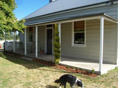
we spent 5 weeks painting this old place to look like this...

AFTER

We had to remove the old rails as they were all rotten and left it open to let more light in. The cottage flowers have been moved to other areas and box hedges put in their place along the veranda. They are growing nicely now. My Dad done all the wood work, so all we paid for was the materials! We get a lot of people stopping to take photos of this lovely old place, which used to be the Doctors residence in the 1800's. All of the colours are from Dulux.com>.  Main colour is 'Warm Grey', trim 'Antique White USA', and the darker grey is 'Woodland Grey'.Dulux>, 'Chalk White USA'. We also had to get a custom hall runner made as our hall
is really wide and a standard size one just looked lost!
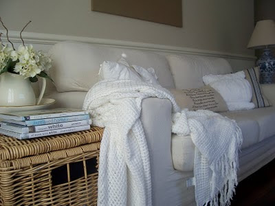
BuysterLighting and is just right for this home...not too flashy and a little subdued. The sofa with the pattern is being covered as we speak to match the other sofa, which I covered myself with a drop sheet. It looks so much like my expensive linen and with two little boys running about, linen is an option we will go with later. You might notice there is no rug down...well this is taken up in Summer and with the boys in and out we just pull it up and put it back down come Autumn. The canvas is temporary and is normally above our bed, my Sister painted it for me as a gift and nearly
everything you see has been picked up at old wares stores, charity shops, markets and the like.


The trunk was $5.00 and all of the pillows on the sofa are from myStore.


BEFORE

Next up is the kitchen. We have an amazing big cast iron combustion stove in here which makes the best winter stews. This shot was taken when we viewed the house and the previous owner was a folk artist and loved the real country look.


AFTER

Gone are the mice and the dolls etc. I gave the mantel a fresh coat of paint and painted the black brickwork in a stone coloured paint, inspired by Tricia Foley's Long Island home.


You can see the stone paint a little better here. This mantel changes weekly, so not many shots of this are the same. This mirror was hung to bounce some more light around and was made by Dad with mirror tiles from Ikea and scrap wood.
BEFORE

Here is a shot of the kitchen when we viewed the home. It was only recently that I have painted the cupboards. We lived with this 70's wood for nearly 7 years!

AFTER

A fresh coat of 'Chalk White USA' and some chalkboard paint made the cupboards look so much better. This was taken before our brushed nickel handles arrived. We also put in a new kitchen window and added the wicker roman blinds. The iron chandelier above the table was $10 from a cheap junk shop. The bloom sign was painted by me from left over exterior paint and scrap wood (and I know it is crooked in this shot, it moves all the time). I really like this space now.


BEFORE

Next up is the bathroom. It actually looked worse than this when we bought it can you believe?! The bath was black, the walls were a bile creamy colour and it had a yellowy pull down blind on the windows which stopped any light coming in.

AFTER

A coat of primer over that cheap pine and some white enamel paint and a fresh coat of white on the tub outside has made such a difference already.

BEFORE

Now for the inside. This was the dark hallway when we first moved in. There was really thin ranch board (the fake wood stuff) on the walls and a very dated colour scheme. Oh, and the red carpet we named 'Prostitute Red'...it was horrid!


AFTER

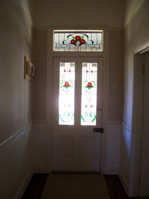
Much better. New plaster board, polished floor boards and a lighter colour palette let so much more light in and all of this was done by my Husband, Mic, his Uncle and I.


BEFORE

This shot doesn't do that red carpet justice!! The old arch in the hall way blocked a lot of light also, so it had to go too.


Another angle of the hallway. This is when I painted it white and it was this way for about a week. Mic didn't like the all white, so I painted it back to a shade he thought was the original!!! All of the carpets were ripped up and the original boards were sanded and polished with a high gloss. We had the pro's do this as there was a lot of work with the old wood.


The colour in here between the picture rails and chair rails is a custom colour which I matched from a piece of linen and the white is from

I am sorry but I couldn't find any before shots of our living area. This is the family room and we have a main living area which is our main bedroom at the moment (I will show you in a moment). The same colours are carried through in here and we added the double French doors as the windows were rotten and could not be opened and I am a fresh-air-aholic!. We get the most amazing breeze from the ocean through these doors as you can see.

Here is a shot through the French doors. The light fitting is from  .We have since ripped up the disgusting linoleum floor to expose the original Tasmanian Oak floorboards from the 1880's.  Mostly they are in great condition, but there are a few which we need replacements for and finding them is proving to be difficult. They are an inch thick and you can't put new ones in as they stand out (we tried in the kitchen) and they will never get the patina of old boards...so the search continues. The mirror here is by Dad, and the little cupboard Dad made also out of an old wardrobe to get us by until we renovate this room properly. At the moment our laundry is in here too...the room is massive and we will be adding some walls to section off the laundry from the bathroom...stay tuned!

BEFORE

We are blessed to have 5 fireplaces in this old home, but they were not all that pretty when we bought it!
This one is in the main living room which is now our bedroom. We don't need 2 living areas as we like to be together. I wanted to show you this one as it is the most dramatic change I think. The old mantel was cracked and my Mum rescued it for her own place (Dad fixed it) and we found a great one in the garage under some old wood the previous owner left behind!


AFTER
We painted this 'new' one white and used the stone coloured paint to cover the Burgundy that was one the tiles, actually it was more purple than burgundy (I have a horrible name for this colour, but lets not go there!).
The purple was painted white also and the red carpet, which had a iron burn right in the middle of the floor, was ripped up and the floorboards painted with> Cabot's Timber Colour in Chalk USA...and what a difference it made. So, as you can see I love a challenge...and a bargain. If you would like to see more, just head over to myblog or to myStore. I would love to have you.

Thank you again Lauren for asking me to take part. I enjoyed finding the old photos.
It just reminded us how far the old place has come.
Ness xx

-------------------------------------------------------------
Ness!  THe difference in the house is night & day!! It's so light & airy & easy breezy now. You did such a beautiful job on your home & thanks so much for sharing it with us!!
xoxo,
lauren