Monday, March 7, 2011

Pretty easy breakfast

I love simple special meals. (Yes, there are times when I like to go all out & spend a ton of time doing something really special, but for the most part I like to keep things quick and easy.)  On the weekends we like to do leftover breakfasts where we use everything leftover from the week in the fridge. 

Here's a picture of something I like to do to make it feel more like a treat:


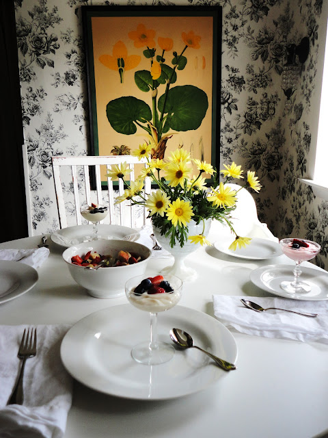
{Yogurt in my husband's Great Aunt Stella's etched crystal dish}

Plain old yogurt from the plastic Dannon containers it in a pretty dish with fresh fruit on top just tastes so much better.  My husband brought home these pretty yellow daisies and I loved them with the yellow botanical in our kitchen:


We loooove leftover breakfast burritos:


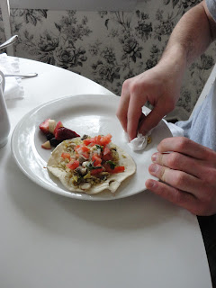
This week we ended making them out of eggs, white rice (leftover from the Chinese takeout the night before), sausage, mushrooms and fresh homemade pico de gallo.


{Justin wearing his burrito }


{Here's a picture of me making my visiting cousin babywipe his plate off so I could take a pretty picture of his burrito.  See what it's like being related to me??!}


{And I said I wouldn't put this picture of them in their pjs on here but I couldn't resist.}


Hope you had a great weekend-  Ours was crazy busy but good!  {I left my daily planner/ schedule at our hotel in LA and had it next day aired home via UPS but came to find out this morning- 3 days later- that they accidentally sent it back GROUND...  I am seriously a lost person without it and feel like a total mess!! eeeek}.  We have a small photoshoot here in the "studio" (i.e. my basement) for Piccola Magazine today, so I'm off to clean.

Anyway, would love to hear your breakfast shortcuts!!

xoxo, Lauren

If you'd like help creating a home you absolutely love, contact me about our design services.

Friday, March 4, 2011

New Irregular Blog Series

As anyone who writes a blog, knows, reading comments from readers is always a bright spot in the day.  I often go back and read them multiple times and either feel good, take mental notes because they're so informative, laugh, tear up, get excited or just mull them over.  I've been thinking about this for a while now...

At the Design Blogger's Conference, Paloma who writes one of my favorite blogs, La Dolce Vita, mentioned that readers love series & regularity in a blog.  (I know I do)   But, if you've been reading my blog for any amount of time, you probably know that I'm not very regular and really don't know what I'll write before I actually write it on most days.  The last time I tried a series, it was Pure Organization... Do you remember that?   (Yeah, I doubted you did! ;)   I loved it at first but then having it be so regular started to feel like work to me and I really don't want any more work.


{Pure Organization Project #2... Redoing the coat closet}

I use this blog as an outlet of sorts and what's coming "out" of me isn't very regular.  BUT I have decided that I will start a very tiny not-rigidly-regular blog series called In  your words, in which I'll share a favorite comment whether it be because its's informational, inspirational, funny, poignant, etc. from a past post.  I have so many and know could never get to them all, but it's my small way of thanking you for reading along & taking the time to leave your thoughts. 

So... today I've got an informational comment to share from the post I wrote waaaay back called Brass is Back, which you can read here. The commenter, Blogardener, writes:

The brass that is so universally hated is actually LACQUERED. Brass, either oxidized or polished, has a lovely mellow warmth. The cheapy builder's stuff has a bright, almost cool yellow tone. Cool + yellow = blech! You can remove the lacquer for the beautiful metal underneath unless it isn't solid brass at all, but a brass PLATE that's been lacquered. That's the stuff I'd paint or replace.


Brass is gorgeous, mixes well with other metals, historic (the real deal has never gone out of style), and it cleans itself of bacteria every eight hours (oligodynamic effect). Not so with steel or porcelain (which was ironically once a popular replacement for brass knobs because it was thought to be antiseptic).

So glad to see this post!


{Southern Accents Kitchen via Urban Grace blog}


Blogardener does not have a public profile but I will be sure to link back to any commenters that do!  I think what she wrote about the builder's brass is so true and how to tell if you can/ should redo ir replace.  As with most things in design, trends are in a constant state of flux, so it's really best to go with what's right for you and forget about what's in or out. 

Enjoy your weekend!!  Also, I'll be posting in-progress pictures of the DC Design House on the Pure Style Home facebook page in a little bit if you want to check it out.   (You can click on the left sidebar of the blog to "like" Pure Style Home on facebook.)


xoxo, Lauren

If you'd like help creating a home you absolutely love, contact me about our design services.

Wednesday, March 2, 2011

Where I've been...

{Jack of Fox 5 filming the 'before' in my DC Design House Room, photo by Sherry Moeller}

Wow. 
We just got home from a crazy weekend/ week in California.   After a great Bare Bones Tour at the showhouse in DC on Saturday (pic above), I hopped onto the plane with my husband, Dave, and 3-year-old, Christian, to LA.  We got in late that night and rented a car and drove to Disneyland. 

The actual purpose behind our trip was the Design Blogger's Conference but we were able to sneak Disney in on Sunday, which was awesome. 

{Breakfast = Room Service}

I looooove staying in hotels and it's been a while.  I think room service might be my favorite part.  {Once when Dave & I were first married, we brought our card table to our bedroom and put a tablecloth on it with yummy food and pretended we were getting room service.  hahah I know how sad that sounds but it really was great and this reminds me that I want to do it again.}

I loved our first hotel in California, which was the Hyatt by Disneyland.  The view was awesome and because of the 3-hour time difference, we got to see the sunrise: 


I haven't been to Disney since I was a kid and I don't think I've ever been to Disneyland before. (Just "World.")  It was so pretty!  I picked up a new camera at the Target there because my massive camera is tough to carry around and whip out at a moment's notice.  We've been meaning to get a tiny one for a while and I'm so glad we did. 

Soooo... I went a little picture crazy.  Definitely annoying.  I took pics of everything:


{Castle Pond}


{Two ducks in the pond...  it looked like they were kissing when I clicked the button, but I guess I was too slow for her.}


{Christian on the shuttle to Disneyland... Wondering what in the world this "Disneyland" we'd been hyping up actually was.}

loved this one:

{the teacups}

I loved being around all of the green.  Everything's dead at home and getting a dose of color just felt so good on the soul.


I am officially dying for Spring.


Want some of these bad boys lining our property:


And I had to take this pic of It's a Small World:


The Haunted Mansion has always been my favorite:


I caught a glimpse of the Evil Stepmother peeking out from the curtains:


{kind of spooky}

And I was crazy over the tour through Sleeping Beauty's Castle.  I loved it!!


After Disneyland, we headed to LA to the Sofitel for the Design Blogger's Conference.  Christian ended up getting 2 really bad ear infections and we spent an afternoon at the medi-merge (he was balling/ screaming.. have never seen him like that) so I did miss a bit, but I can't wait to share the good stuff I did get to hear/see. 
For now though, I'm off to bed and will be sure to share details as soon as I can get a bit caught up around here.   I met a lot of amazing women and it was so nice to be around people who get this whole blogging thing.

Before I run, here's a peek at my design board for the DC Design House Room: 


Shocking, I know, but I went with greens.  Since this is really the first time I've ever gotten the chance to design with no real budget contraints and no client, I really wanted to do the space almost as if it were my own.  I have imaginary clients in mind with this space, and if I had to describe them, I'd say they're an older thoughtful couple who loves to both travel and be at home.  They've collected interesting pieces & objects over the years and I gave them my personal design aesthetic.  (Hence, the green and tradtional-vintage-modern mix)  I envisioned the room as a "hideaway" room in the upstairs of the massive Tudor home.  It's the place where people can go to get away from everything: read a book, take a nap, write, blog, etc ;) ;)  I like to imagine that anyone stumbling into this room would feel like they could use it as their own.  I would have loved exploring the house as a kid and I can imagine a child laying on the window seat, reading a book and wondering about the paintings on the walls.  I wish I had this getaway room in my house. 
And finally, thanks to everyone who sent me Disney advice... we took it and it was perfect!!

xoxo, Lauren

If you'd like help creating a home you absolutely love, contact me about our design services.

Friday, February 25, 2011

DC Design House Bare Bones Tour!

If you're free tomorrow, I'd love to see you at the DC Design House Bare Bones Day!  You can view the "before" of the empty house and view designers design boards for their spaces & talk to them about their plans.  I'll be there bright & early in my updtairs bedroom at 10.  (10 is bright & early for this mama who lives way out in the 'burbs ;) 

Tickets are $20 each and proceeds go to Children's Hospital. 

We're flying out to LA for the Design Blogger's Conference tomorrow late-afternoon so I'll be staying at the Showhouse until a little after 1 or so before heading to the airport. 

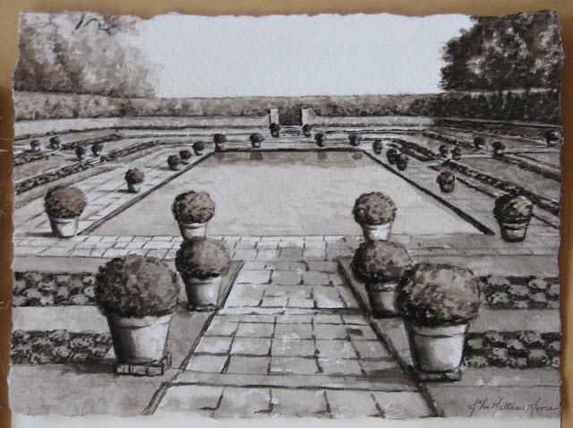
Here is a little peek at a photo of the grisaille "sketch" done by John Matthew Moore for my design board:

{I want to be there}

Outside of the house in DC, there are boxwood gardens so we thought this painting of English gardens would be fitting for the room.  This little painting is based on a photo Matthew took on one of his trips.   I cannot wait to see it enlarged!! 


{John Matthew Moore in his gallery}

Want another peek of his gallery?  (I thought you would so I took lots of pics!)  The Gallery in McLean is not completely finished but is still gorgeous:


{Recognize those robin's eggs paintings?}


{Some of the beautiful frames available... art in and of themselves}


{Loove these chairs... Matthew reupholstered them in a levendar-gray velvet with jute trim.}


{the desk}


{gorgeousness}


{I love these little sheep paintings hung in the window}


{The pedestal table displays some of lighting designer Rick Singleton's repurposed lighting projects}


{check out this antique beauty... I love the nailholes left over from its lifetime of different identities}


{And one last parting pic of the Gallery}

For information on Matthew, Rick and their work, go here.   http://johnmatthewmoore.com/

I met Matthew & Rick this past September when our good mutual friends, Eddie & Jaithan were visiting.  We went to the best little burger place around in McLean & had a great time.  I was literally blown away by their work & couldn't wait to use pieces of theirs for clients.  When the DC Design House came around, I immediately thought of Matthew & Rick & how amazing pieces done by them would be.  I was thrilled when they were on board to contribute to the bedroom!  They have both had pieces featured in past Design Houses and I kid you not, I got so excited I chills when I saw the gallery the first time with Eddie & Jaithan.  It just oozes with creativity and makes you need a piece for your own home. 

Throughout the next coming month or two, I'll be sharing photos & info on all of the people and companies who are contributing to my room in the DC Design House.  They're such a creative talented group & they've all been so generous.  The Children's Hospital Showhouse definitely takes a village and I can't wait for you to "meet" everyone! 

The Design House Bare Bones Tour tomorrow will be a lot of fun, so please come if you can!! 

For the address & info for tomorrow, go here.:  dcdesignhouse.com

xoxo, Lauren

If you'd like help creating a home you absolutely love, contact me about our design services.
Thursday, February 24, 2011

Apartment Therapy Design Evening in DC


If you're in the DC area, come out to this month's Apartment Therapy Design Evening on March 16th.  I'll be speaking about design, my new fabric & furniture lines, the showhouse and other random things and would love to meet you!!  (Like I mentioned, public speaking makes me a little nervous so friendly faces would be a huge plus :)  It's a great chance to get to meet other bloggers & design-obsessed people and it should be a lot of fun.  So come out if you can!!

To see details and RSVP, go here
The location listed is tentative so be sure to check back prior to the event... they are trying to get a larger space. 

Fingers crossed! eeeeek

xoxo, Lauren

If you'd like help creating a home you absolutely love, contact me about our design services.

Wednesday, February 23, 2011

Newest Textile Design- Magnolia

I wanted to share another little peek of my new textile line...  This design is called Magnolia and my friend (and super-talented artist), Kat Wright, painted it for me.  It will be available in several colorways and here's a quick look at two of them, both on linen.

Here's the blue colorway:

{"Magnolia" in blue by Lauren Liess Textiles}

And here's the True/Green:

{"Magnolia" in true by Lauren Liess Textiles}

I had to use my camera phone & the pics really don't do them justice, especially the True.

I love magnolias and look out at my neighbor's massive magnoilia tree fairly often, wishing it were in my yard.  For this pattern, I wanted an overscaled pretty-yet-wild feel.  It's a floral but its leaves are just as prominent as its blooms which I think makes it a little less sweet.

I can't wait to start using these in projects ----   eeeek!!

I'm still working on finalizing pricing but hope to have them up and for sale in my online store by mid-April.

ps- I looooved your ideas about outdoor fabrics so am looking into it!

ppss-- I'm headed to LA this weekend to the Design Blogger's Conference and we're taking Christian to Disneyland!!  Let me know if you've signed up for the Conference!

Also, The DC Design House Bare Bones Tour is this Saturday from 10-4.  I'll be there so stop by if you can!  Click here for details. 

Finally, I'm joining up with Apartment Therapy on Wednesday, March 16th for a Designer Night in DC.  They're still finalizing the location so as soon as I know you'll let you know.  I definitely get a little nervous about public speaking so fingers crossed.


xoxo, Lauren


If you'd like help creating a home you absolutely love, contact me about our design services.

Monday, February 21, 2011

Garden of Giants

Why is it that when we're outside, we create spaces that remind us of being inside, and when we're inside we (well, definitely me) create spaces that remind us of the outside?  Outside we make "outdoor living" spaces, treehouses, fun sheds, outdoor kitchens, patios with rugs, etc...  and inside we want our windows wide open to reveal views of the outdoors, and we use natural materials & objects to bring nature in.  I'm really not sure why but I guess I'd say it's because we want the best out of both??  As humans, the outdoors is beautiful & awe-inspiring but maybe it's just in our DNA to make shelters and/or nest?  I'm guessing not everyone has this bug, but for those of you who have it, you know it's like that pregnant "nesting" stage for life. 


{image from Atlanta Homes & Lifestyles Blog}

I loved my treehouse as a kid... I seriously used to sweep it!! (and you know I hate cleaning)  Yet just as much, I loved sleeping with my windows open so that it felt almost like I was outside.  I loved camping outside but I loved going into the cozy tent to sleep. 


{our Girl Scout tents were soooo not this great... image from http://www.prospectortent.com/products.html }

Anyway, when it gets warmer out, my mind always goes to gardening & enjoying the yard.  Last year we planted wisteria along our fence and are a backwards with it, but are adding a pergola to our gate for it to grow over this year.  There's something about outdoor spaces that are just a tiny bit enclosed & private that I love. 


This year, we're planning something really special for the kids (&us)  thanks to this book my mother-in-law gave me:

{by Sharon Lovejoy found here}

It's called Roots Shoots Buckets & Boots and I am craaaaazy about it.  Seriously, it makes you want to go out and start digging.  I planted my daffodil bulbs this weekend after taking a peruse.  (I know I'm a couple of months late on that but I heard from  good source that they might have a shot?? )  In her book, Sharon Lovejoy outlines 12 different types of gardens you can make with y our kids.  (And honestly, whether you haev kids or not, these gardens are a-mazing.)   I want to do a couple this year but the one we're definitely doing is the "Garden of Giants."   It's actually a "living fort" that the kids (and me!) can play in.  They crawl through a tunnel of beans to get to a teepee of gourds surrounded by a giant pumpkin patch. 

{image from ArtisanArt.biz... how gorgeous are these hanging gourds?!!}

You have to wait to start planting until it stays above 70 on most days so we'll need to wait a while for that (umm... yeah snow storm coming tonight what???!!) but I CANNOT WAIT!!!  For anyone interested in joining us, you can buy pre-done seed packets for the Garden of Giants here or you can get them on your own. 

I'm curious to see how this turns out.  I love to garden {mostly on weekends} but am an impatient & neglectful gardener...  things that don't need a lot of tending (or um watering) do really well at our house.  So we'll see how this goes.  If it works, I'll take lots of pictures.

xoxo, Lauren

If you'd like help creating a home you absolutely love, contact me about our design services.